
Problem
Patterns drift as the product grows.
Similar screens evolve separately. Names, states and implementation details become harder to compare across design and code.

Design systems
We create practical design systems that connect design and development, improve consistency, and reduce the repeated work that slows product teams down.
The same component exists in several inconsistent versions
New screens take too long to design and build
Designers and engineers use different names or rules
Light, dark, responsive, and platform variants are difficult to maintain
Product quality depends on who worked on the feature
The existing UI kit looks complete but does not support real product logic
Foundations
Color, typography, spacing, grids, elevation, iconography, motion, and accessibility rules.
Design tokens and variables
Semantic foundations for themes, screen sizes, platforms, states, and future product changes.
Component libraries
Reusable components with real content, variants, properties, interaction states, and responsive behavior.
Product patterns
Repeatable solutions for navigation, forms, data display, feedback, permissions, empty states, and complex workflows.
Documentation
Clear guidance on when, why, and how to use the system - not only what each component looks like.
Governance and adoption
Naming, contribution, review, release, and migration practices that help the system stay useful after handoff.
We inventory existing patterns, compare design and code, and identify duplication, gaps, and high-value priorities.

We agree on naming, foundations, token structure, component logic, supported platforms, and ownership.

We start with the components and patterns that unlock the most product work, then expand based on real use.

Every system decision is validated inside realistic flows and layouts. A component is not finished until it works in context.

We collaborate with engineers, review built components, and resolve gaps between design intent and production behavior.
Problem
Similar screens evolve separately. Names, states and implementation details become harder to compare across design and code.
Approach
Connect semantic tokens, component behavior and usage guidance, then test them in real product flows before extending the library.
Explore the Flutter systemColor, typography, spacing, corner radius, elevation and motion.
A scalable token-based architecture established consistent foundations for color, typography, spacing, corner radius, elevation, and motion, making the system easy to maintain and extend.
See case studyExtending existing component libraries without compromising consistency, accessibility, or development efficiency.
See case studyBuilt a reusable collection of production-ready Flutter components including buttons, inputs, navigation patterns, cards, dialogs, lists, menus, chips, switches, selection controls, feedback components, and layout primitives.
See case study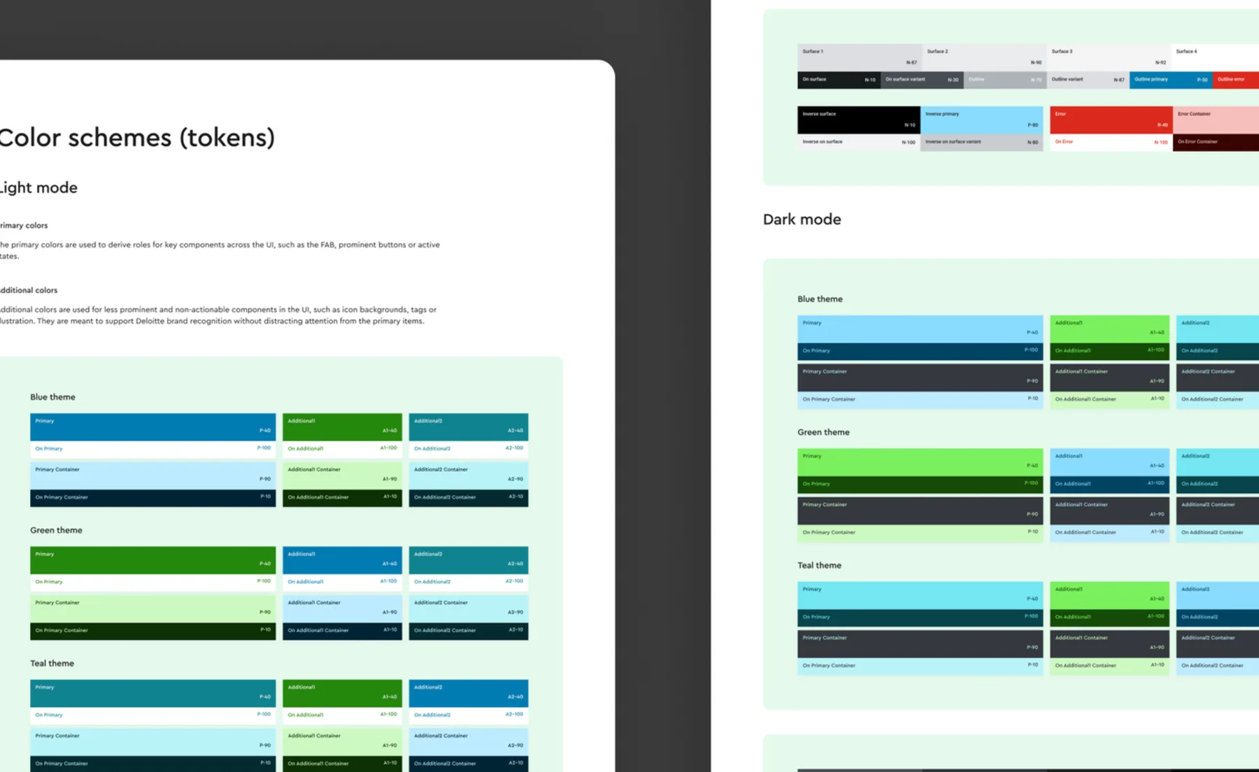
Designed a scalable Flutter Design System built on Material Design 3 and enterprise UI foundations, creating a reusable component library that accelerated product development and ensured consistency across future mobile applications.
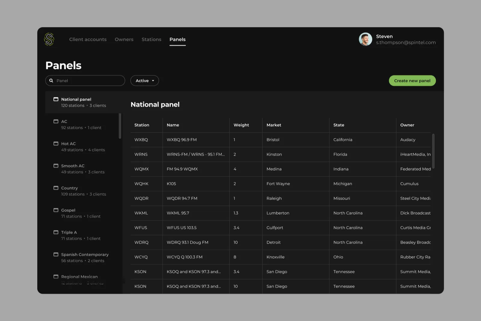
A case study on designing a music analytics platform with intuitive dashboards, data visualization, and a scalable design system that helps users turn complex data into actionable insights.
SaaS product design for onboarding, dashboards and complex workflows. Explore Clearl’s analytics and operational platform work, UX audits and design systems.
Explore industryProduct design for wellbeing assessments and fitness experiences. Explore Clearl’s work with student wellbeing dashboards and the Fitpool mobile platform.
Explore industryPropTech product design for property portfolios, compliance tracking and operational dashboards. Explore Clearl’s property monitoring platform experience.
Explore industryCreate a shared foundation that makes every future release faster and more consistent.
Book a design systems call